Have Google Introduced New Favicons to Confuse Users into Clicking More Ads?

Earlier this week, Google announced their January 2020 Core Update, and as the week rolls on, we’re seeing the impact the update has had on clients and users alike. Many are claiming that this has been a big one, with big effects for site owners, but user interface in SERPs is the most obvious, and problematic, visible change we’re seeing right now.
Google’s New Look
We’d known Google had been trying out a new look for their SERPs for a while now; the new interface with favicons located next to the URL in their search result snippet has been live on mobile since May 2019, and there have been several test runs spotted over the past year across browsers where the URL is placed at the top of the snippet. But with the January 2020 update, we’re now seeing this consistently across desktop too.
Like every update that changes a user interface, this will take some getting used to. But initial reports from users have swayed more definitively towards the negative aspects of the redesign.
Problematic Favicon & Ad Confusion
The colourful update to include a favicon next to the URL in a search result snippet means that brands can be more quickly and easily identified, however there has arisen an issue:
Ad content is no longer clearly identifiable amongst a sea of favicons.
Where a search result is an ad, a bold black “Ad” label simply replaces the favicon next to the URL, but many claim that this isn’t enough. Google states that the new search result snippet layout is not designed to confuse:
“The format puts a site’s brand front & center, helping searchers better understand where information is coming from, more easily scan results & decide what to explore.”
Instead their attempts at transparency seem to have backfired. Ads have become almost indistinguishable alongside organic search results, leading users to believe that Google is trying to pull the wool over our eyes.
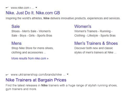
Over time, Google’s search result ads have blended more and more with organic results – where once we had a shaded background, later a bold yellow or green label, in the past few years this has been reduced to a simple green box, and now indistinguishable from the favicons of organic search results:
And nowhere is the issue more clear than this:
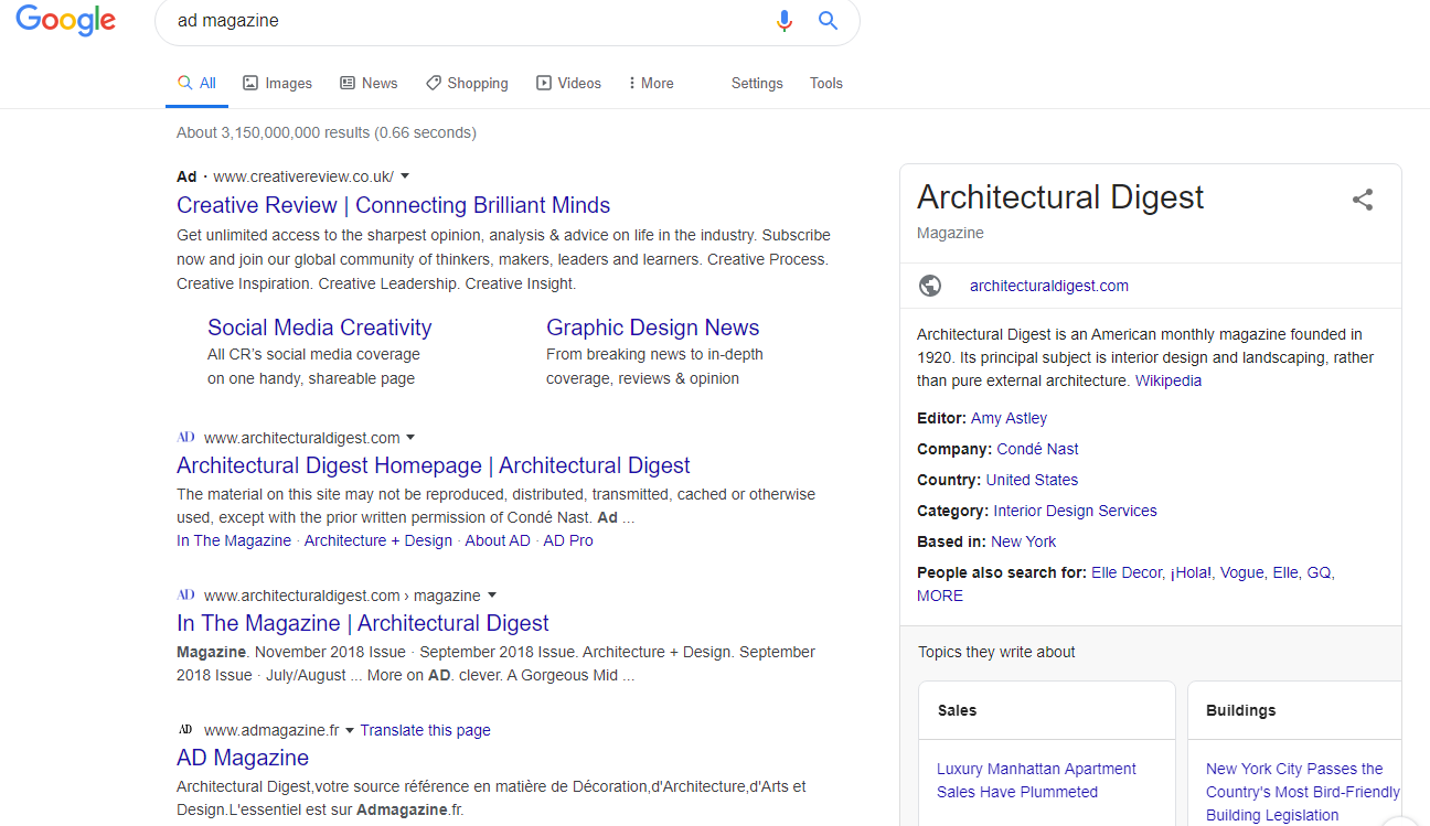
Tell me, as an unwitting user glancing over these search results, which is the ad?
In addition to this, since the ad label replaces the favicon in the search results, brands choosing to advertise are not able to show their branding. Does this sway back in the other direction, drawing users away from ads because the brand is unclear?
Potential Favicon Manipulation
Another question that the new layout has highlighted for us is whether favicons can now be used to manipulate. Is there anything to stop a site using someone else’s branding to make their search results stand out? Of course, just like with a brand using someone else’s logo for advertisement elsewhere, this is governed by trademark law.
But if you consider retailers who sell products from several manufacturers – these ecommerce sites have the rights to use the manufacturers’ logos to market their products and could quite easily set up a favicon for each manufacturer on their individual pages to try to trick a customer to click through to their site thinking they’re going elsewhere.
The result may be a rather confusing list of search results from several different retailers all using the same logo, negating the need for a favicon in the first place. Will Google need to implement a system for approving branding to be used in favicons?
January 2020 Core Update
As for the wider January 2020 Google update, like previous recent updates, the only advice Google has given is of the E-A-T variety. Since their core updates now cover such a vast range of elements within the algorithm – for example, Penguin, Panda and unnatural link warnings have all been rolled into the core algorithm for several years now – it’s becoming more and more important for site owners to focus on quality always rather than simply fixing for the updates.
So what do you think of Google’s new look? Genuine attempt at more transparency or deliberate attempts to draw more clicks to ads?
Share this article
Like what you’ve read, then why not tell others about it... they might enjoy it too
We'd love to hear from you!
If you think Bronco has the skills to take your business forward then what are you waiting for?
Get in Touch Today!
Discussion