Google Analytics Snapshots: A Quick Rundown of Monthly Stats

Whilst I was at home the other night my phone pinged to say I had an email, I was initially about to swipe left to delete it without further thought, but at a quick glance, I saw it had a subject of “Google Analytics”, and the first few lines of text in the preview where stats which included “Your monthly snapshot”.
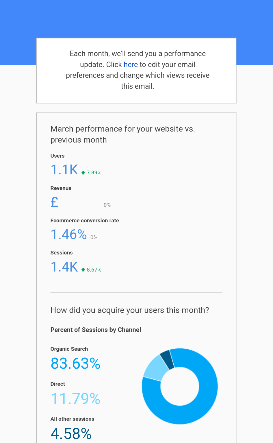
It turns out this email is an official report generated by Analytics and on a basic level, and to be honest, it’s actually pretty good. All your important stats such as Users, Revenue, Ecommerce Conversion Rate & Sessions are included, and even feature a handy little arrow to say whether you’re up or down in comparison the previous period, and by what percentage.
Towards the bottom of the email, there’s a clear call to action which links your straight through to your Analytics dashboard – a great inclusion if there’s something in your snapshot that looks a little untoward.
To get these emails, you’ll need to head into the user settings in Analytics and make sure tjat the box is ticked for “Performance Suggestions and Updates”
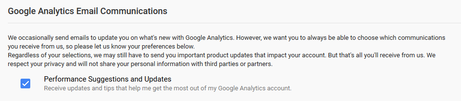
Once you’ve done this you can select which analytics profiles you want emailed to you.
Going forward, it would be great to see some slightly more in-depth customisation in these emails, such as a top selling products or most visited landing pages. Of course, these stats are available when clicking through from the email, but it would be handy to have these viewable in the email, with the option to chop and change which stats feature in your monthly snapshot.
Share this article
Like what you’ve read, then why not tell others about it... they might enjoy it too
We'd love to hear from you!
If you think Bronco has the skills to take your business forward then what are you waiting for?
Get in Touch Today!
Discussion